Industry

Education

Client

NSW Department of Education

Timeline

Sep - Dec 2023

NSW Department of Education Design System

NSW Department of Education Design System

NSW Department of Education Design System

Main Project Image
Main Project Image
Main Project Image
Main Project Image
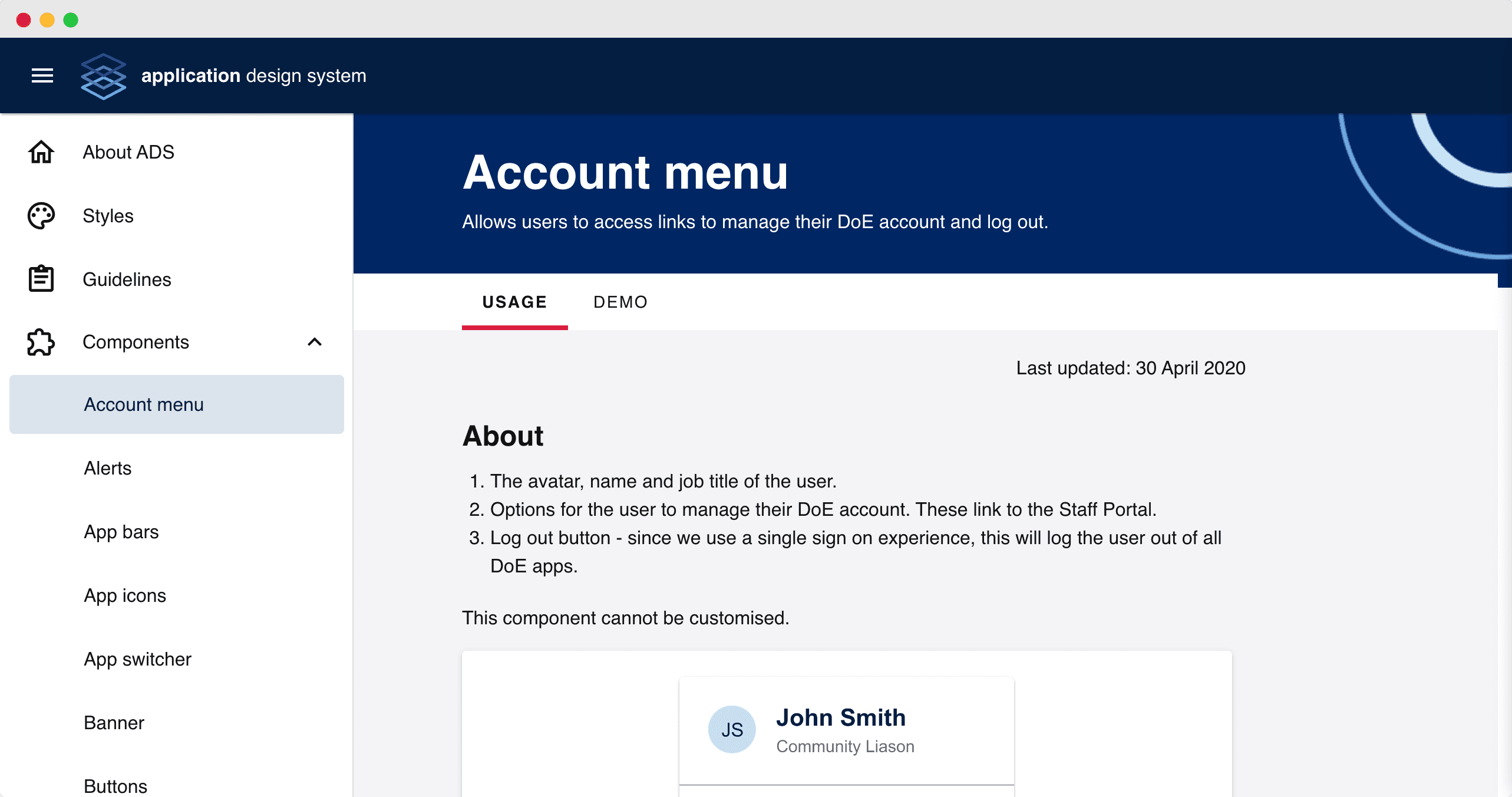
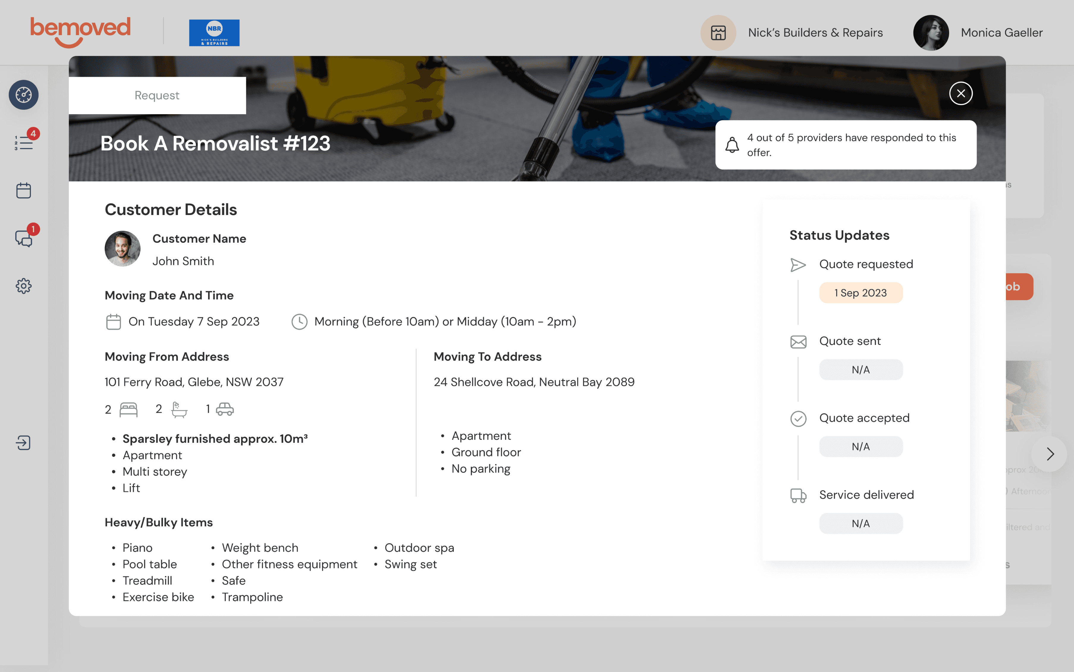
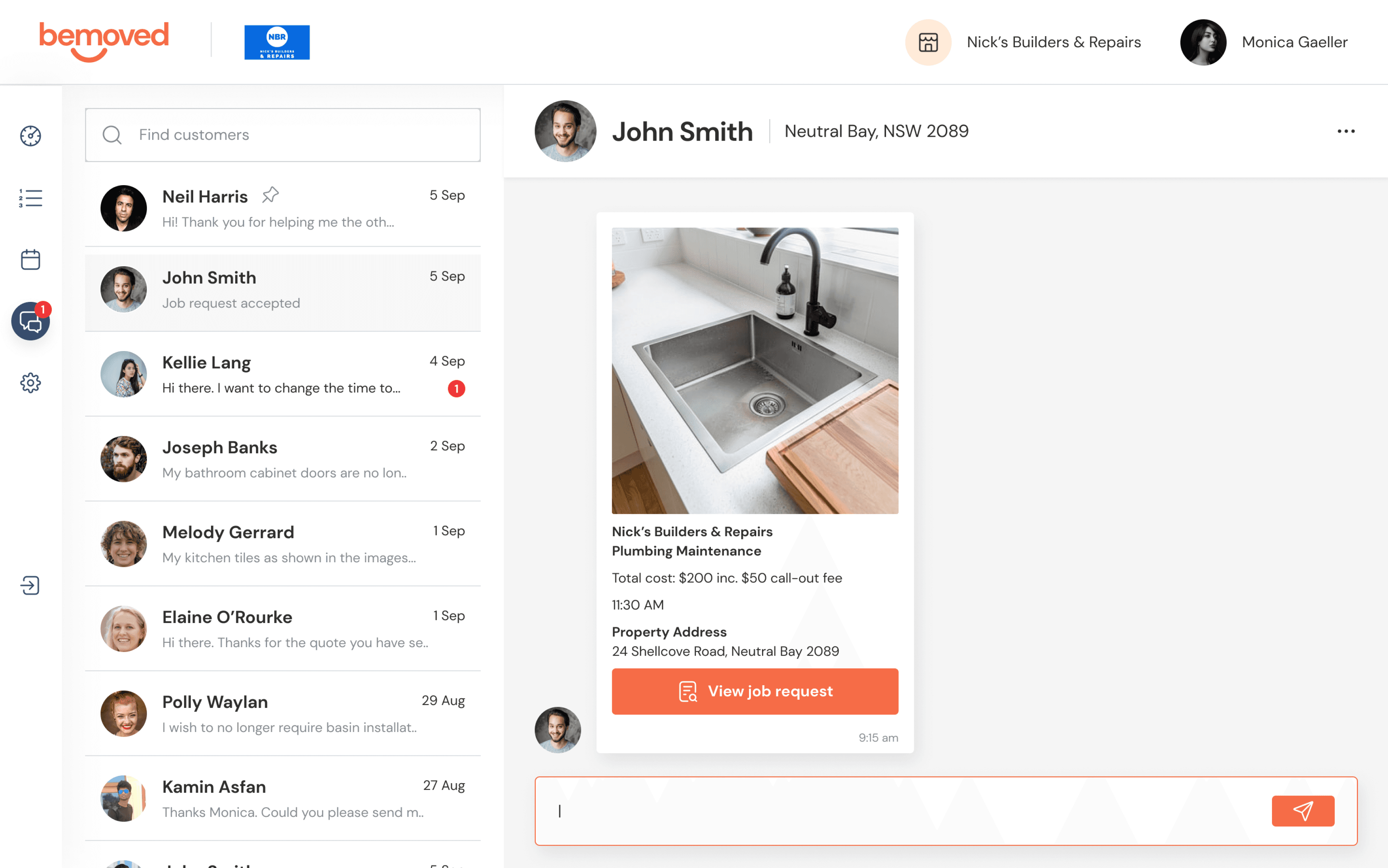
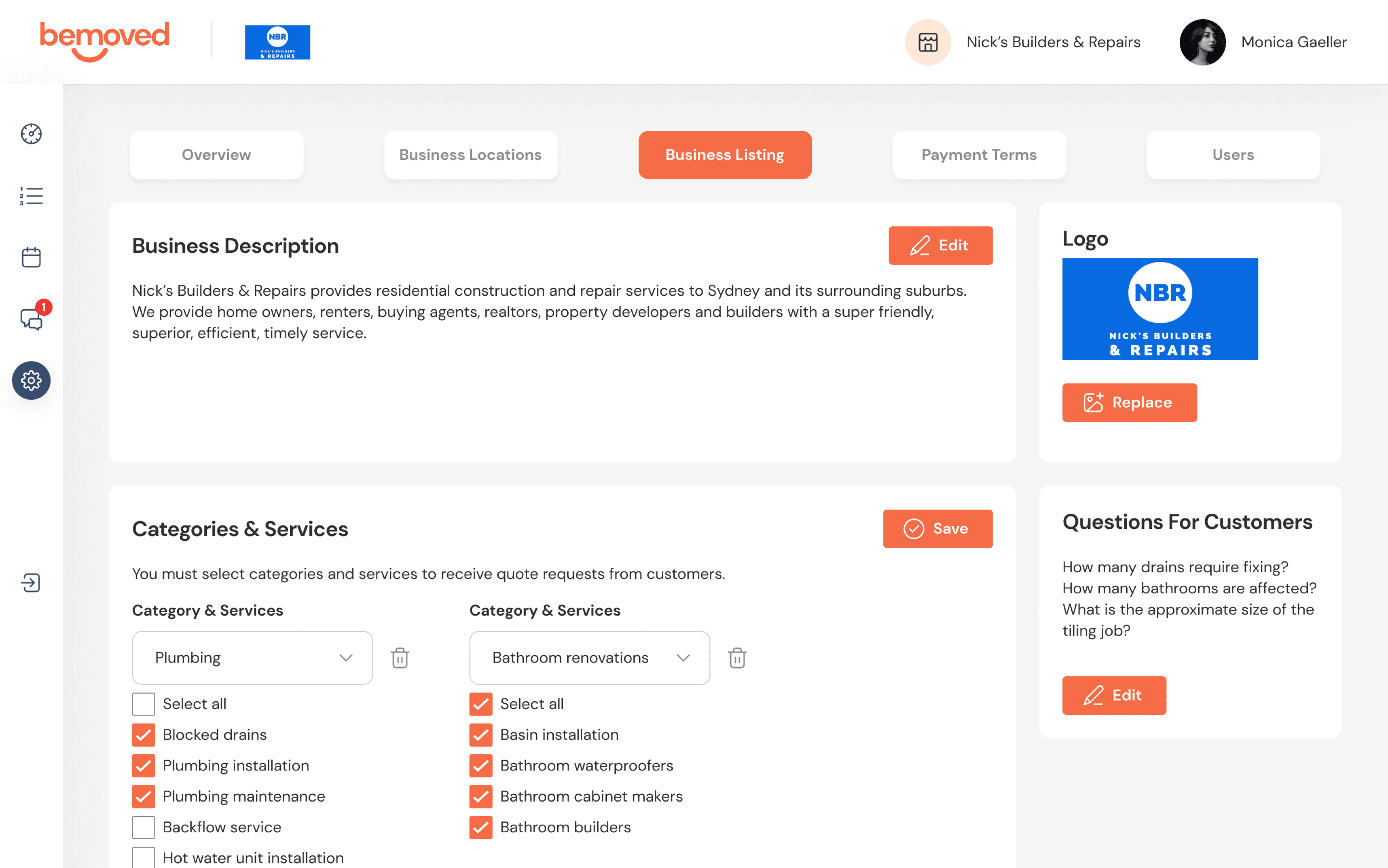
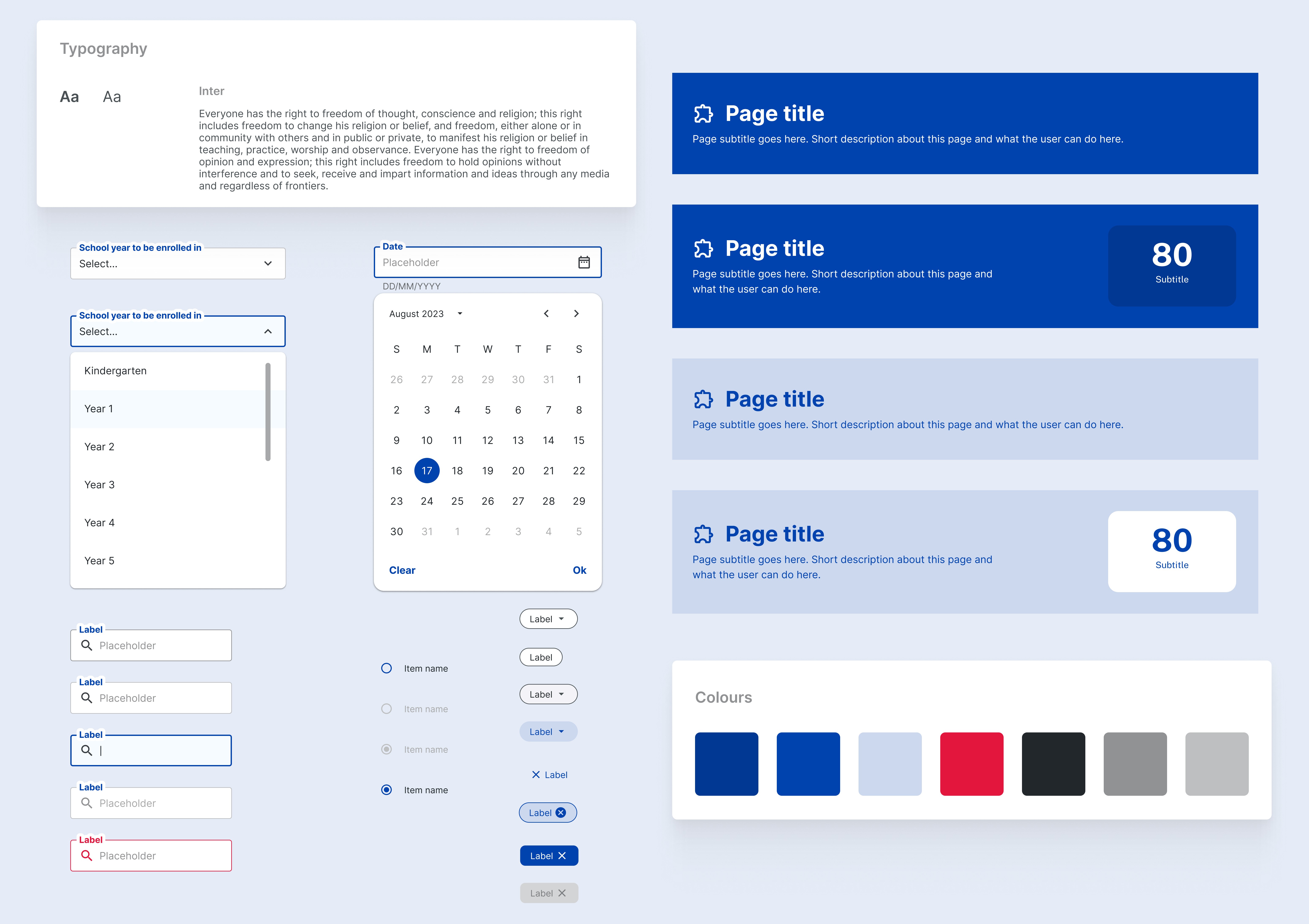
I’ve used different shades of blue, red, and neutral colours to protect the actual brand colours. This approach ensures confidentiality while still showcasing the design process and maintaining the integrity of the project's visual presentation.

Revamped their design system, including over 20+ reusable components, that adhere to WCAG accessibility guidelines.

Project Summary

NSW Department of Education's design system was outdated due to some WCAG-compliant websites/applications using old components from Material 2, we saw the need to update the design system using the latest Material Design 3 and the latest Vuetify components.

My role

Problem

In the Online Enrolment System (OES) team, and other project teams, we encountered inefficiencies when starting new design projects. Each time a new project began, we created components (and their variants) from scratch, which led to inconsistencies and redundancy. To streamline this process, a centralised design library is accessible to all designers, project managers, and engineers.

In the Online Enrolment System (OES) team, and other project teams, we encountered inefficiencies when starting new design projects. Each time a new project began, we created components (and their variants) from scratch, which led to inconsistencies and redundancy. To streamline this process, a centralised design library is accessible to all designers, project managers, and engineers.

In the Online Enrolment System (OES) team, and other project teams, we encountered inefficiencies when starting new design projects. Each time a new project began, we created components (and their variants) from scratch, which led to inconsistencies and redundancy. To streamline this process, a centralised design library is accessible to all designers, project managers, and engineers.

Without a unified component library, we repeatedly set up new libraries. We made the same components over and over, with each component customised to fit the specific functionality and requirements of its project. To solve this, we needed to:


  • Recreate old components that were used across projects for consistency.

  • Gather all previous use cases and establish clear use cases for each component to ensure they meet diverse project requirements.

  • Conduct a style audit to consolidate brand elements, creating usage guidelines for branded colours across different web apps.

  • Audit all components in Figma, reviewing library and project files to define a single, standardised component with its variants as the “single source of truth.”

  • Ensure compatibility with Material 3 by aligning new component designs with Vuetify’s interaction patterns, so they function consistently across platforms.

Contribution

During weekly design reviews, this is how I created an impact:

  • Built a centralised, accessible Design System: developed a unified design system to streamline the rebranding of web apps across different project streams.

  • Designed the brand style guide: refreshed and documented updated brand colours, logos, and guidelines to ensure cohesive application across projects.

  • Created interactive states and component animations: defined and designed interactive states and animations for components, enhancing user experience consistency and engagement.

  • Collaborated closely with senior front-end developers: engaged in 1:1 discussions with the senior front-end developer to make informed design decisions that optimised usability and performance across products.

I designed light and dark mode:

  • Responsive banners (with and without stats)

  • Buttons (toggles, segmented buttons, checkboxes, radio buttons)

  • Chips

  • Input fields

Application Design System (ADS) 1.0

Due to NDA, my design contributions are disclosed. To view my designs, email me at cindychandigital@gmail.com to receive the full Case Study or book a chat with me! 😊

Thanks for reading this far!
UX/Product Designer based in Sydney | Made with ☕️ in 2024

UX/Product Designer based in Sydney | Made with ☕️ in 2024

UX/Product Designer based in Sydney | Made with ☕️ in 2024

UX/Product Designer based in Sydney | Made with ☕️ in 2024