Industry

Finance / Banking

Client

People First Bank - Academic project

Timeline

Jun - Aug 2024

Designing Trustworthy Online Banking: Reshaping Financial Experiences for Young Audiences

Designing Trustworthy Online Banking: Reshaping Financial Experiences for Young Audiences

Designing Trustworthy Online Banking: Reshaping Financial Experiences for Young Audiences

Main Project Image
Main Project Image
Main Project Image
Main Project Image

A bank that serves a wider community

Project Summary

People First Bank aims to become a digital-first bank with an appealing offering for younger audiences to increase its market share among millennials and Gen Z. Its mission is to deliver enhanced products, digital capabilities and competitive pricing while supporting community and environmental initiatives.

My role

Working solely, I designed a responsive, mobile-first website for the banking industry, and presented my usability testing findings and final design work to the marketing and product design leads at Heritage Bank. I was one out of 4 other UI Designers who took the Harness Projects online course. Our weekly meetings involved sharing our designs with the group and mentor, Sam Hancock, which improved everyone's overall project.

People First Bank

Heritage Bank merged with People’s Choice Credit Union to create a new mutual bank, People First Bank. The bank has become Australia’s largest customer-owned financial institution. Its mission is to provide enhanced products, services, and digital capabilities while increasing support for community and environmental initiatives.
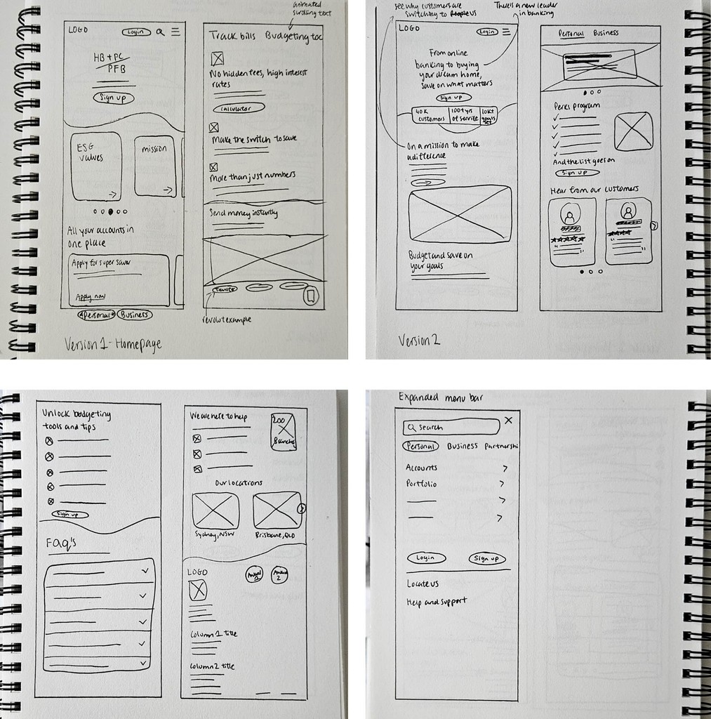
My process


Discovery

Revamping Banking: Building a Fresh, Youthful Brand with a Member-First Approach

Heritage Bank began by working with a team of UX Researchers to gather insights on millennials' behaviours, preferences, and perceptions related to banking. The researchers aimed to:

  • Understand millennials' behaviour and attitudes towards banking

  • Identify key "push/pull" factors influencing their choice of bank

  • Assess the level of awareness millennials have about ‘mutual banks'

Insights from user interviews and surveys with the target audience revealed that:

  • There is a general lack of understanding of what a mutual bank is

  • Fees and rates significantly influence their decision to switch or join banks

  • Millennials show strong interest in budgeting, tracking, and transfer features

Additionally, their users and customers have various financial goals such as Homeownership and travelling, however, not everyone has the confidence or means of knowing how to achieve them, as shown by one particular participant. I wanted to solve this specific problem for users that this bank can offer that's unique to them.

80%

of participants acknowledged that features in a banking app would assist in achieving and monitoring the progress of their goals.


"I wouldn’t say I’m confident. Like 4/10? But [I think] tracking my spending in an automated sense so I don’t have to think about it would be really helpful.”

Participant 7

Using the research done by past UX Researchers, I created a proto persona to understand user needs and build empathy. To address both the users' and business goals, I framed a How Might We statement:

How might we design an intuitive and user-friendly mobile website that communicates our features and rates, ensuring a convenient online banking experience that builds trust with potential customers?

Heritage Bank's business goals for the design of its website are:

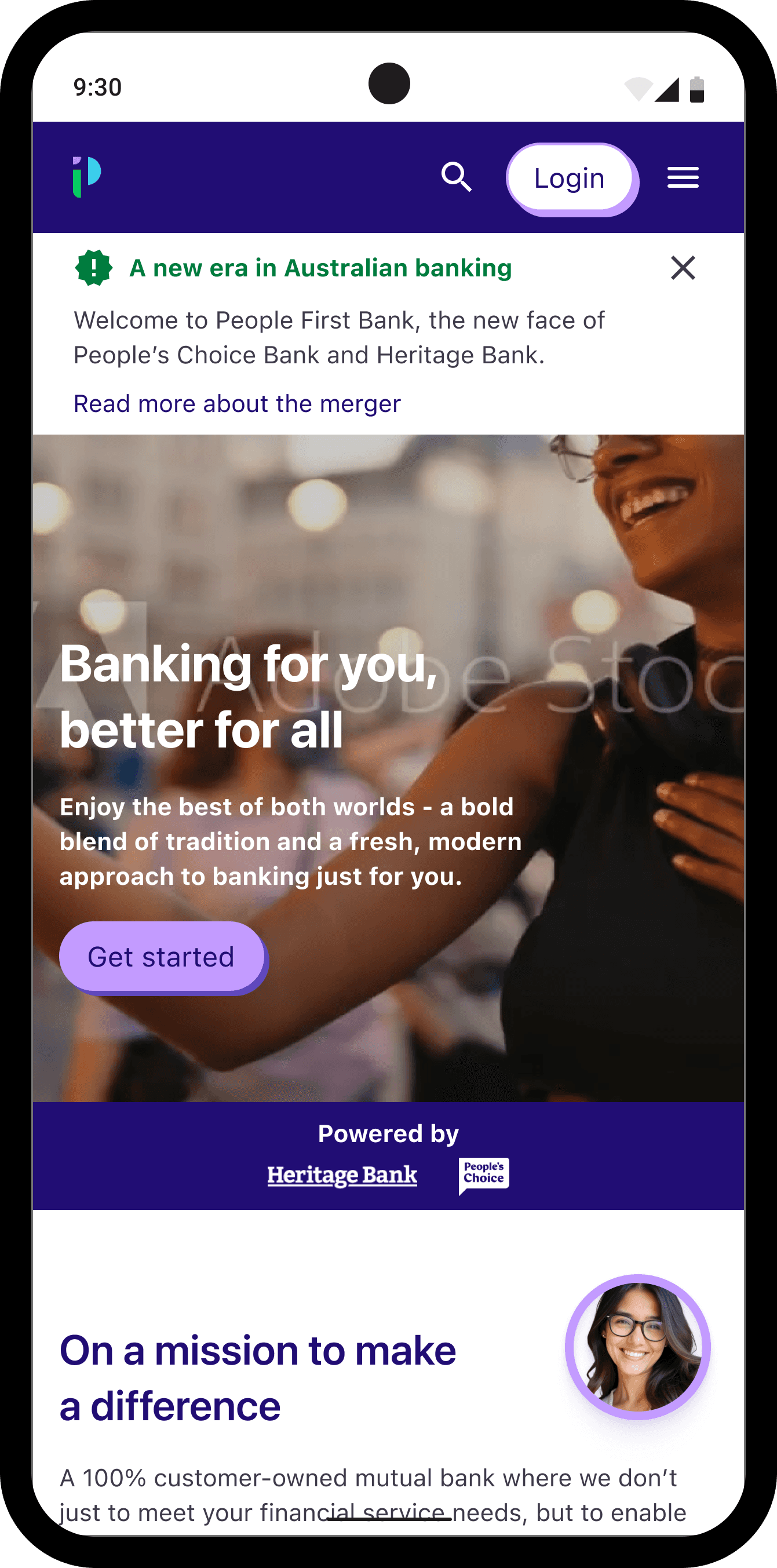
  • Brand itself as a cool, fresh and engaging new bank, attracting a younger audience.

  • Communicate what a mutual bank is and the value of joining a member-focused bank.

  • Design a usable and accessible mobile website

Using the research done by past UX Researchers, I created a proto persona to understand user needs and build empathy. To address both the users' and business goals, I framed a How Might We statement:

How might we design an intuitive and user-friendly mobile website that communicates our features and rates, ensuring a convenient online banking experience that builds trust with potential customers?

Identifying opportunities

Neobanks like Revolut, Neo and Up, are thriving in recent years and it's partly due to their popularity among Gen Z and millennials. Unlike regular banking apps that offer services such as account management and long-term savings, these apps provide a full digital wallet experience, as well as saving pots, budgeting tools, and 3rd party integrations. Communicating how People First Bank can emulate a similar experience, their product offerings need to entice these audiences. Designing digital features of their app, along with these design principles, can make their website intuitive and engaging to users, including:


  • The website should be easy to use and accessible to a diverse audience, communicating the bank's USP

  • Easy navigation to find the bank's products

  • A quick, easy and simplified sign-up process

  • Design interactive elements to engage users


Provide familiarity and ease of navigating a new website

I conducted a card sorting exercise to provide familiarity and ease of navigating a new website to existing customers of Heritage Bank and People Choice. Using both banks' menu item words in this exercise also allows me to capture insights into new users and how they assign and group these items.


Using Lyssna, 5 participants aged 29 - 31 delivered the below results. I discovered that users found two ways they group items:

  1. Grouping several items under Personal, Business and other categories or

  2. Grouping items under product offering names e.g. Accounts, Loans, Online Banking, etc.


A sitemap was then created to identify our users and group their respective categories together.


A user flow was created to show how simple it is to create an account and join the bank as a new customer.


Design and Validate

Using customer testimonials, the bank's security methods during the sign-up process and showing statistics of the existing customers helped to strengthen the bank's trust with new and current customers.

Design and Validate

Using customer testimonials, the bank's security methods during the sign-up process and showing statistics of the existing customers helped to strengthen the bank's trust with new and current customers.

  • Iteration 1

    I sketched my first design by doing the Crazy 8 activity to come up with many possible solutions for the How Might We statement for the home page and product pages.

    Sketches
  • Iteration 2 - wireframes

    Added copy and visual cues to start usability testing and gather feedback from 5 participants.
    Below is an example of a wireflow for a user signing up for a savings account.

    Wireframes
  • usability testing 1

    Based on the insights from the first usability testing, I improved:

    • clearly show what a mutual bank is - users skimmed past reading this section

    • provide options for users to either manually enter their ID or upload a document file of their ID

    Usabilit testing 1 Insights
  • Iteration 3 - Mid-fidelity prototype
    Iteration 3 mid-fidelity prototype
  • usability testing 2

    The second usability testing showed a 100% user satisfaction, with some additional suggestions provided:

    • making the sign up process more secure e.g. strong password, good security questions, 2-factor authentication

    • making the interest rates more transparent on Product pages

    • preferred images over gradient backgrounds used on the website

    Usabilit testing 1 Insights

Solution

The People's First Bank website offers a unique service that provides new customers the satisfaction of banking with a trusted bank, allowing users to sign up effortlessly.

Solution

The People's First Bank website offers a unique service that provides new customers the satisfaction of banking with a trusted bank, allowing users to sign up effortlessly.

Track their money and savings

User research suggests that users "want to track their spending in an automated sense". I introduced the automatic split bill payment featured on the app (shown on the desktop).

User research suggests that users "want to track their spending in an automated sense". I introduced the automatic split bill payment featured on the app (shown on the desktop).

User research suggests that users "want to track their spending in an automated sense". I introduced the automatic split bill payment featured on the app (shown on the desktop).

Valued customers

I added that all existing customers receive a bonus $50 per year for being dedicated customers, as user research indicates that "none of the users believe that their bank prioritises them as customers".

I added that all existing customers receive a bonus $50 per year for being dedicated customers, as user research indicates that "none of the users believe that their bank prioritises them as customers".

I added that all existing customers receive a bonus $50 per year for being dedicated customers, as user research indicates that "none of the users believe that their bank prioritises them as customers".

Use strong visual imagery

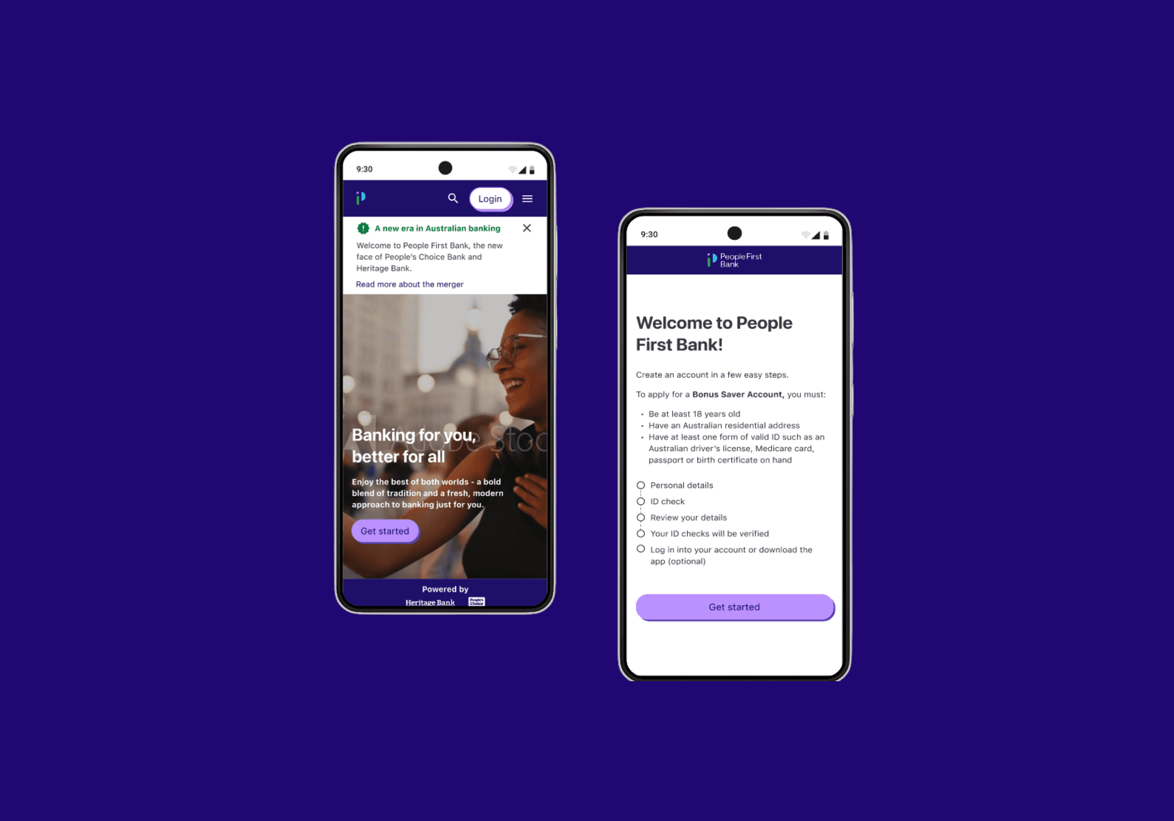
Participants preferred to see this than the coloured gradient background for the home page and product pages, so I created a mock video that connects with the target audience and their lifestyles.

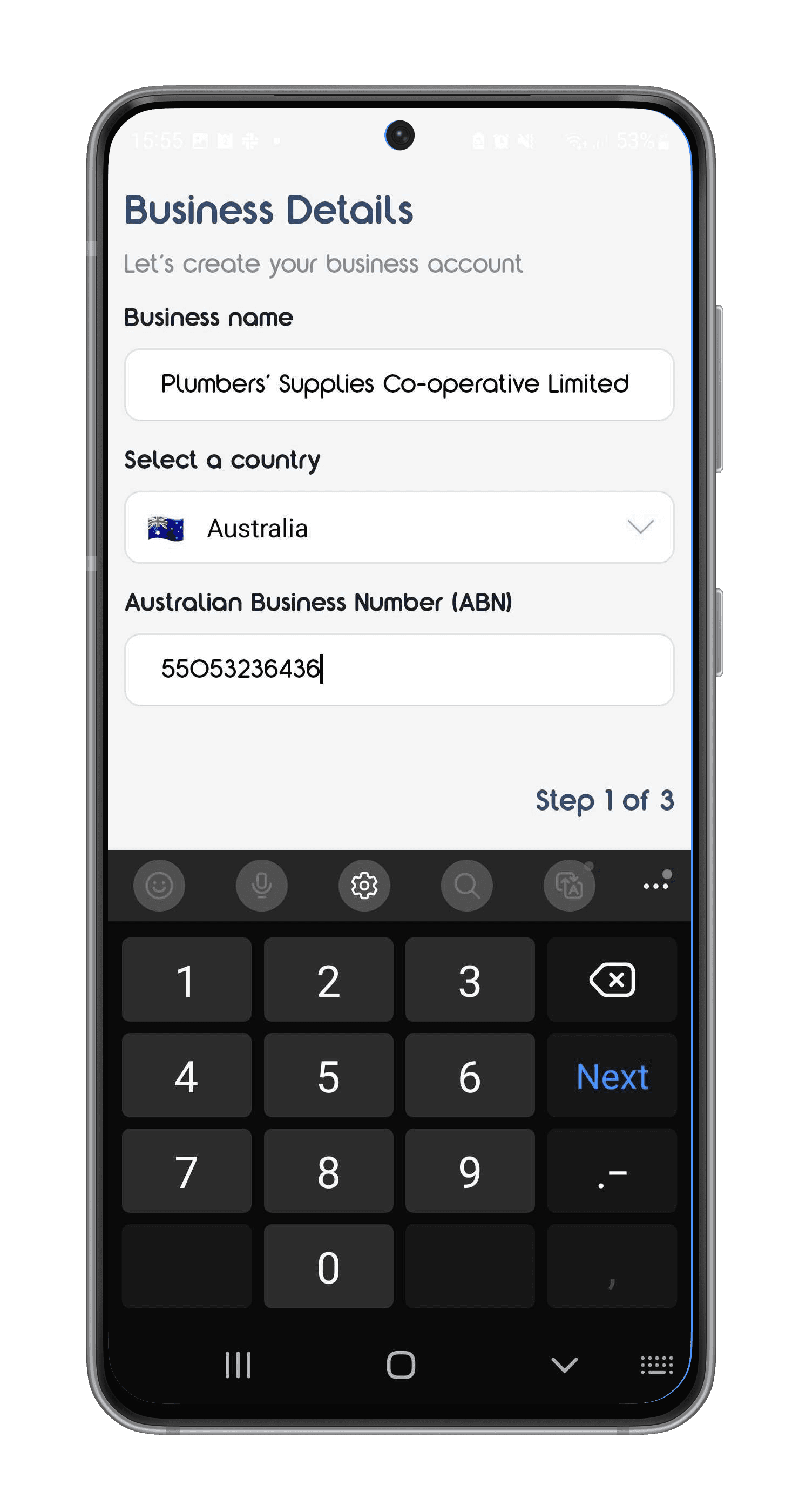
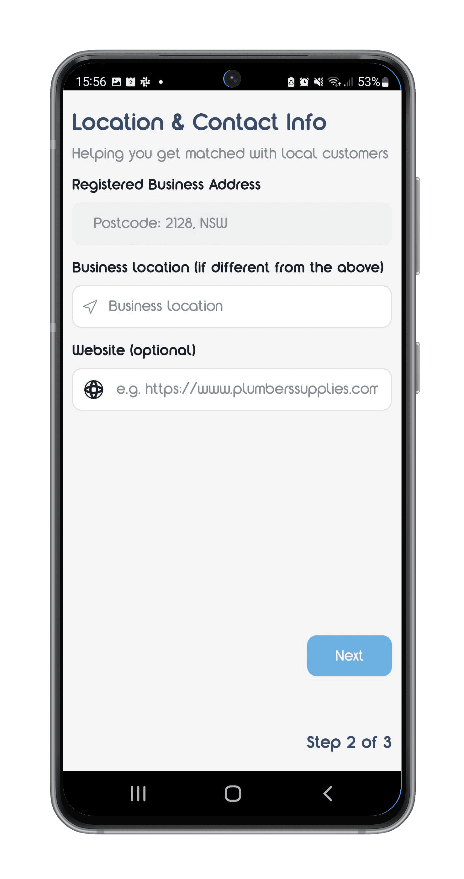
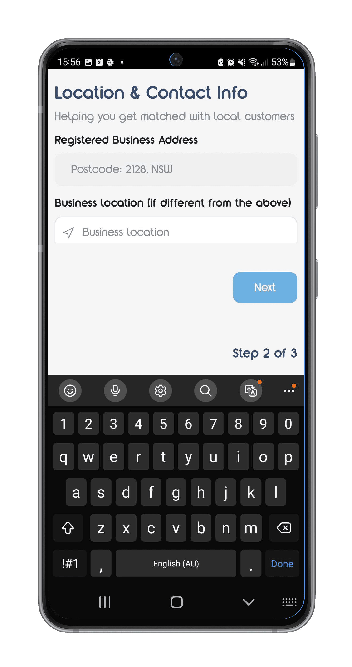
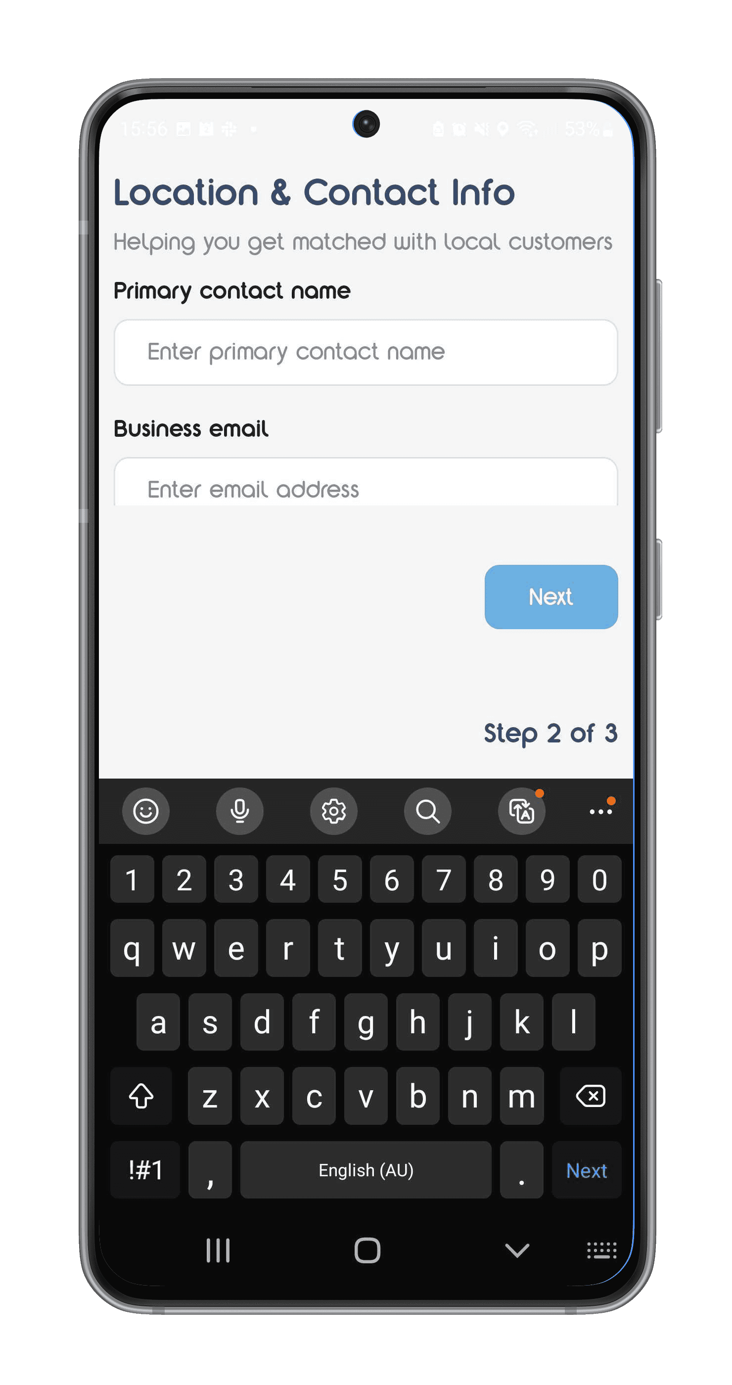
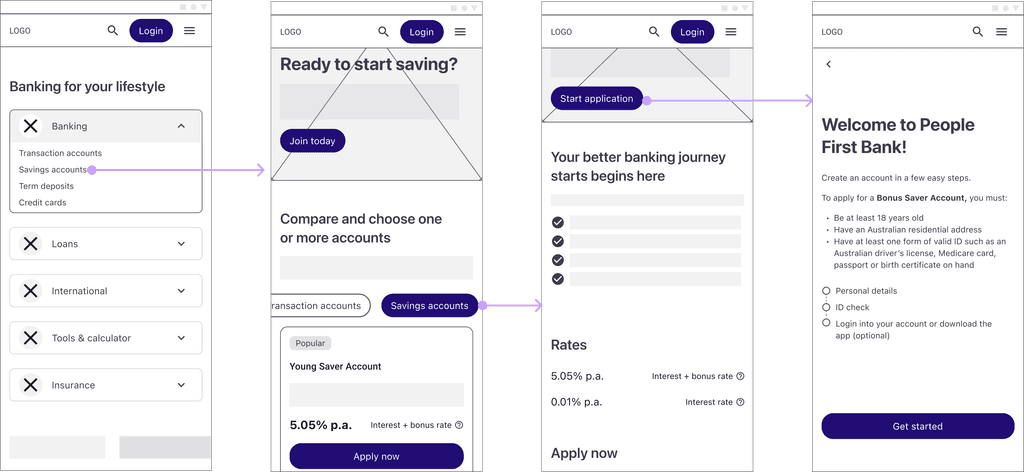
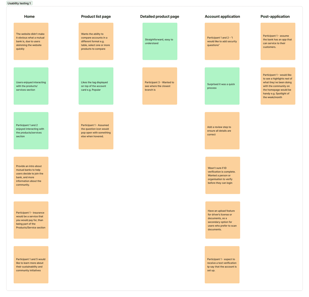
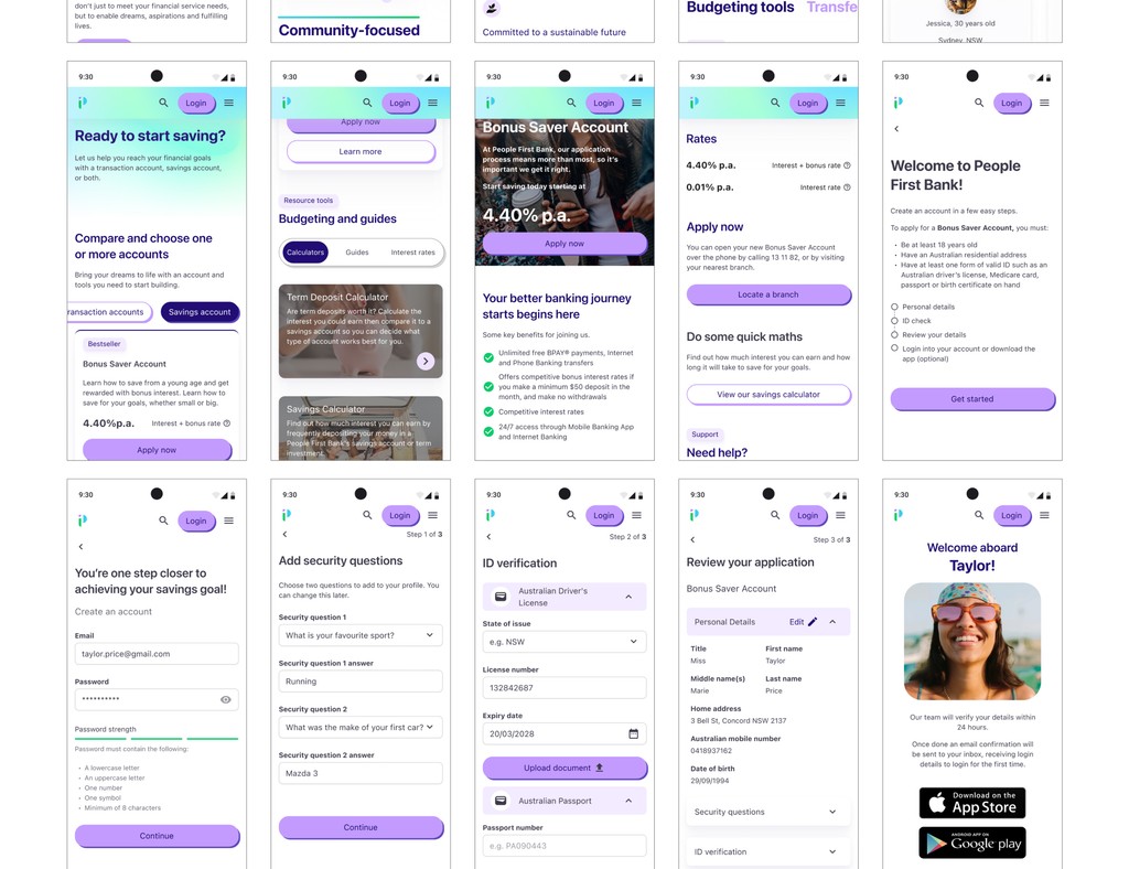
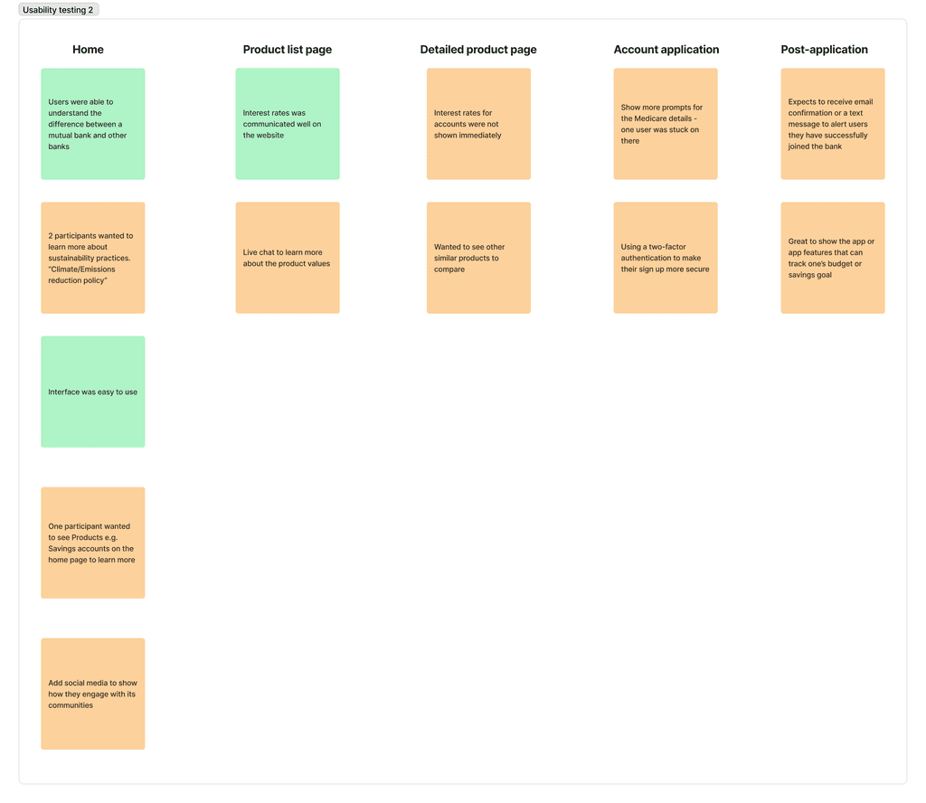
The interactive prototype shows how new users can navigate and find a savings account, in this case, by applying for the Bonus Saver account.
Did you interact with this prototype? If so, I'm interested in learning what you think about this sign-up user flow - How easy was the sign-up task? (1 - Very easy - 5 - Very difficult) What do you think about the application process?

Designing responsively

Key Outcomes

"I liked your How Might We statement, you incorporated trust, one of our values, and you mentioned it numerous times." - Sarah Kelly (Experience Design Lead)


"The sign-up application was straightforward and easy to complete…" - Vanessa (Participant 2)


"I really liked the comparison table that you had..comparing the values of the brand, because normally you would see those comparisons for rates and products. Also with the Help icon, it was a great use of drawing out the fine print and supporting our goal of transparency" - Sheena Jamieson (Product Designer)

Next Steps

Refine the sign-up flow - based on feedback from the second usability test, one user expressed that there were too many steps to complete. Revising the progress stepper or reducing the number of clicks will help with this issue.

Perform A/B testing - discover how well the product pages perform based on the master head content, CTA words, or colour usage to engage users to sign up, learn more about the bank or compare different products.

Creating targeted landing pages for young audiences with different lifestyles - as mentioned in user research, users have a mix of short-term (e.g. travel, saving goals) and long-term financial goals (home ownership, insurance). Creating marketing campaigns as a business goal can increase the sign-up conversion of new customers for these different user groups.

Thank you for reading this far! 😊

UX/Product Designer based in Sydney | Made with ☕️ in 2024

UX/Product Designer based in Sydney | Made with ☕️ in 2024

UX/Product Designer based in Sydney | Made with ☕️ in 2024

UX/Product Designer based in Sydney | Made with ☕️ in 2024